Mobile App | SuperApp | B2C | UI & UX | Usability testing | Prototyping | Journey Mapping
Tools used: Figma
Designed new features in the food mini-app like order batching and pooling, quick add to basket, reorder mechanism, flash promotions, re-design of the restaurant menu navigation and IA, and new user onboarding. The launched features lead to
⬆️
Increased customer retention rate
Increased conversion rate
Increased total monthly orders
⬇️
Decreased time to order
Decreased customer contact rate
Case study 1: Re-order experience
Problem statement
As part of the quarterly OKRs, the team launched multiple initiatives to improve customer conversion
Long time for the user to place an order from the moment they launch the food mini app
High drop off rate after viewing two restaurant menus
Proposed solution
Introduce a re-order feature to speed decision making, and time to order placement
Impact after launch
CTR click through rate = From 3% to 15%
TTO time to order decreased by 5-7 Sec
Conversion improved by 0.7 percentage points
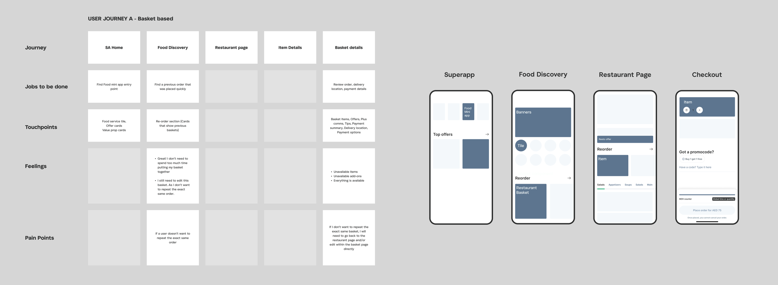
Mapping out the critical touch points of the user journey, as well as the jobs to be done at each touch point
Snapshots from the design process
Design Process:
Mapped out the user journey and its critical touch points to identify where exactly we’ll intersect the experience with re-order components
Within each page identified the jobs to be done at each stage of the journey. As well as, the information architecture hierarchy. By identifying the order of priority (Above or below the fold) for such components
The primary question that required user testing, was to identify whether the user wants to head straight to the basket (Repeat identical order) or wants to head to the restaurant (Repeat restaurant, but not order)
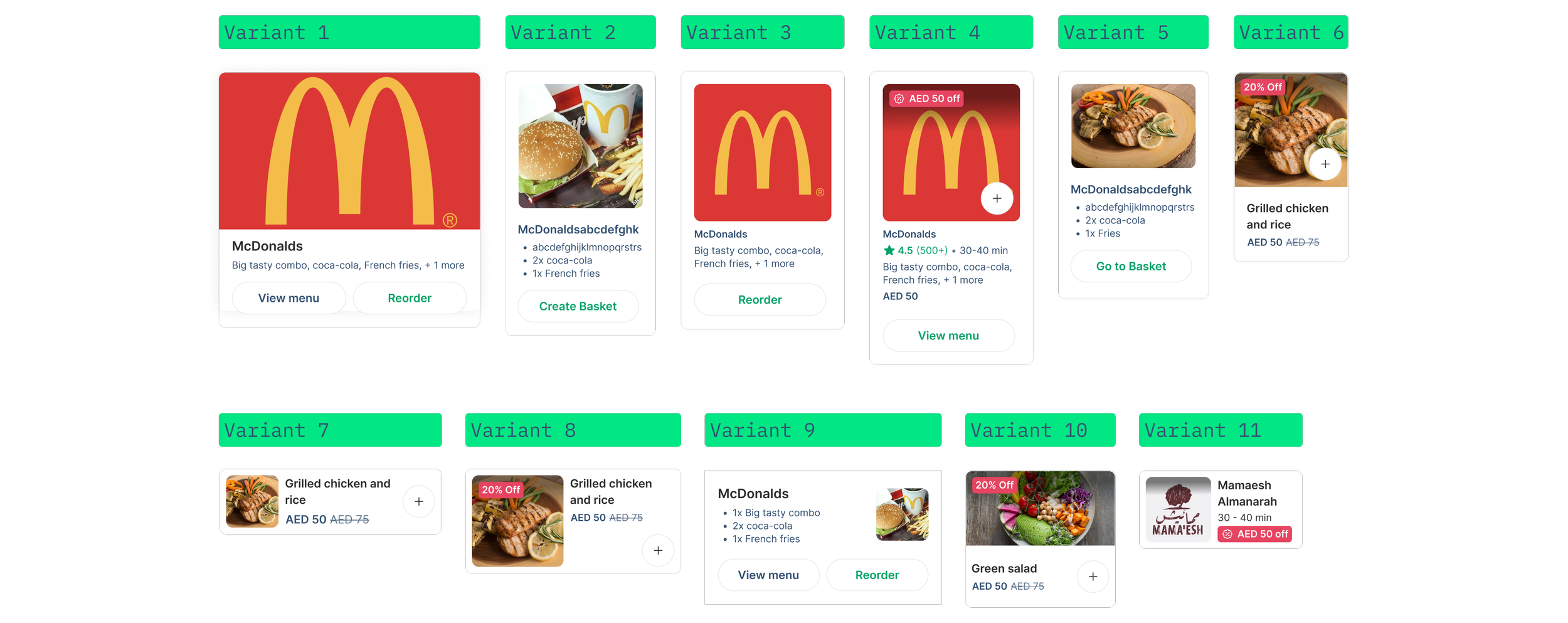
Component explorations
Designed multiple component variants to test for this project
The AB test also included different UX copy
Usability testing
This project has gone through two rounds of testing with 11 participants. 30 minute long sessions.
The key investigations were:
How do users approach re-ordering? Are they recalling the exact meal they’d ordered? Or the restaurant?
How does memory recall get triggered? Via the restaurant logo? Or the meal image?
I proceeded to design varying components that are restaurant based vs meal based. Logo based vs photography based.
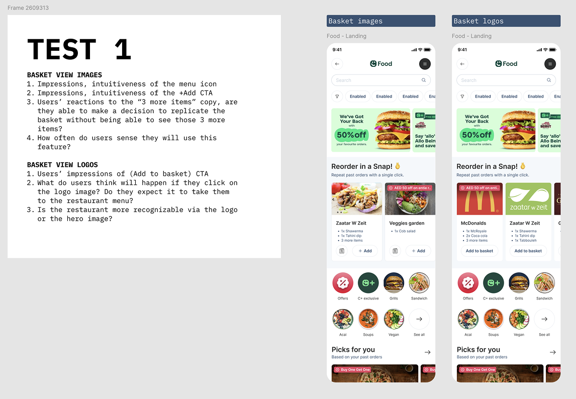
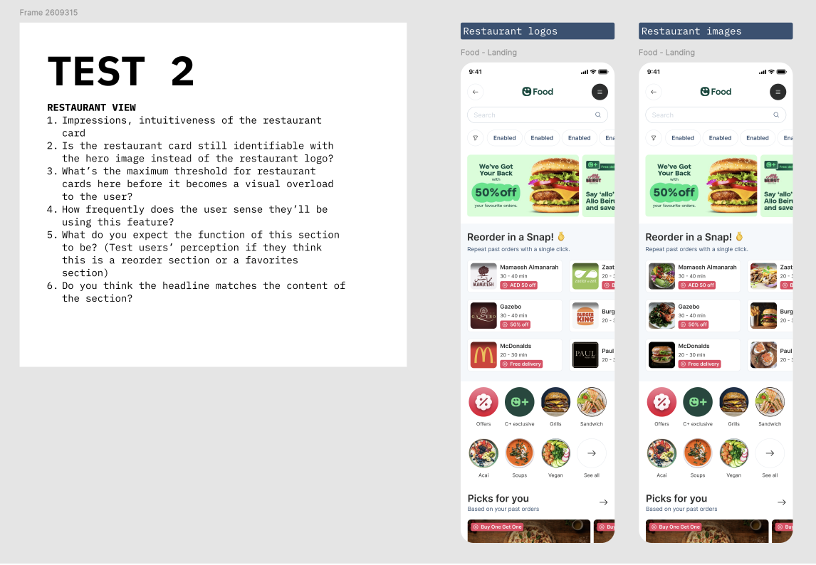
When testing I used a tiered approach, addressing: discoverability, clarity and order recall.
Samples for the exact screens being tested, and what to look out for during the session
Sample from the usability test findings
Final designs
Final selected card components and user journey touch points
Case study 2: Onboarding experience
Problem statement
Low new user conversion
High churn rate of users after placing first order
Perceived lack of restaurant variety
No clear value proposition to distinguish us
Proposed solution
Rapidly frame what the exact differential value proposition that Careem offers to new users the moment they step into the food mini app
Impact after launch
Increased new user conversion by 5%
Design process
Lead multiple workshops with Marketing, Brand, Product and Sales leads from 3 different markets to align on key messages and visual identity to onboard new users.
Identified the key messaging per market, as well as the order of importance to show each message at what stage to reduce churn and drop off rate during onboarding
Lead separate sessions with the cross-vertical design and engineering teams to identify key technical specs, and design system components to unify the onboarding journey across the super app
Workshop 1 results with cross vertical design team to identify where the food onboarding journey fits within the context of the larger SuperApp new user journey
Workshop 2 results with product and marketing teams to define key messaging per market.
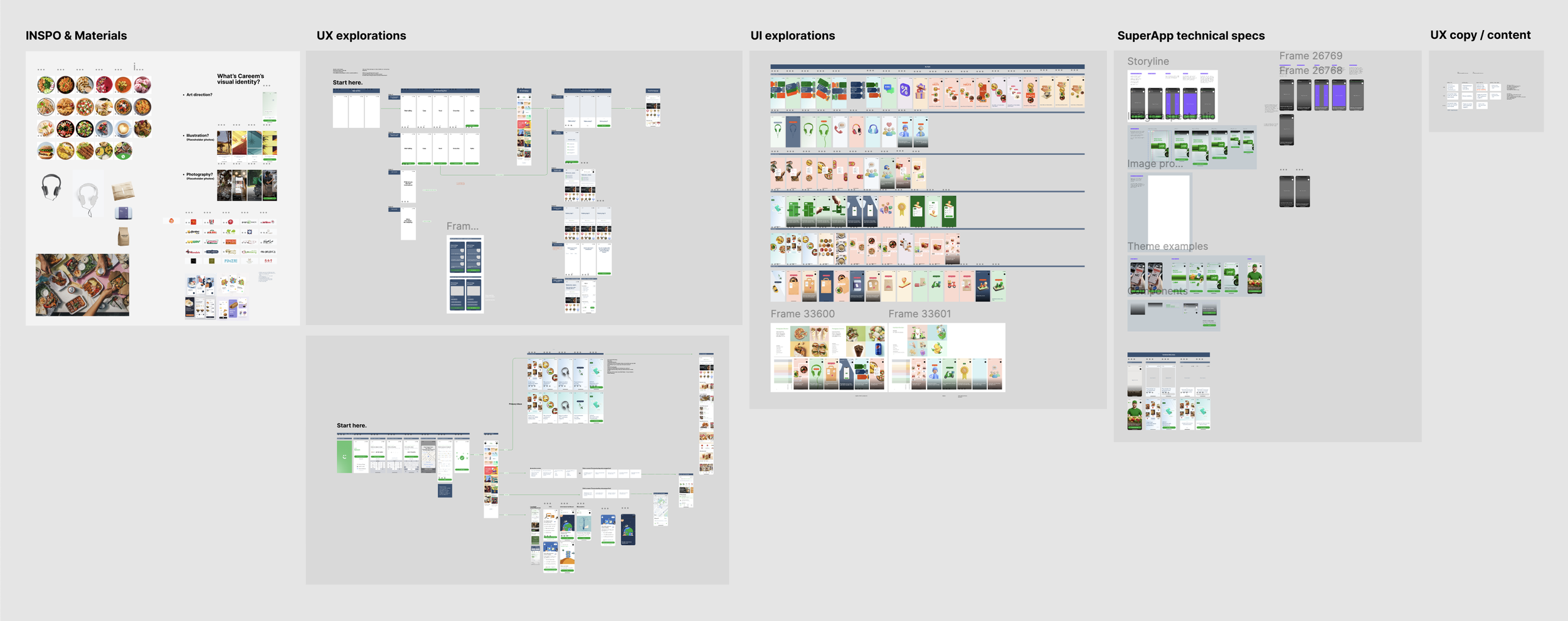
Workshop 3 + some design explorations with the brand team to identify the different visual languages used all throughout the SuperApp’s verticals.
Design explorations
Sample of my design explorations oscillating between flat 2D images, photography and 3D models.
Final Designs
Part of the final submission. Final submission included different screens for 3 different markets in 2 languages.


